Facebook Fonts: How to stand out in the feed (Strategic Guide 2026)
Facebook does not allow changing the native typography of posts, personal profiles, or standard pages. It also does not allow using traditional bold or italics like those in Word.
However, there is a technical way to create text with visual hierarchy that survives copy-pasting, overcoming the platform's limitations. This allows highlighting titles, organizing lists, and improving the scannability of long posts.
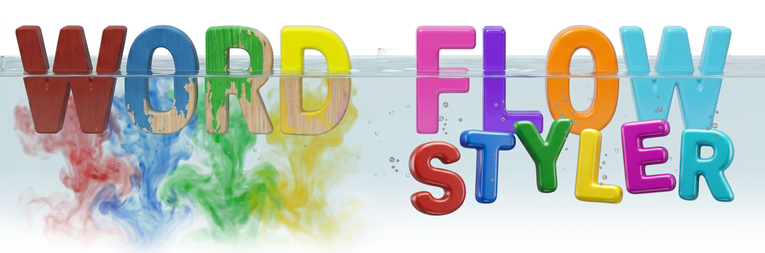
FlowStyler Editor
FlowStyler is the first word processor for Unicode styles. It not only allows applying styles, but also introduces Live Styling: you correct a word, a letter, and the new text automatically adopts the style of what was already written. No more pasting, regenerating, and complaining.
Editing in FlowStyler is like writing in any modern editor, with the difference that what comes out is fully compatible with Facebook, LinkedIn, or X. Plus, it allows combining bold, italic, and underline in the same block, and adjusting UPPERCASE and lowercase without losing formatting. Finally, you have real typographic control within the Unicode ecosystem.
Why aren't these styles erased when published?
To understand why certain letters change on Facebook and others don't, we need to analyze how the software works under the hood.
Classic word processors, like Microsoft Word, Google Docs, Apple Pages, or LibreOffice Writer, incorporate visual style as a layer of metadata completely separate from the text. The content and the appearance live in two different systems.
When you select a word and apply bold, italic, or underline in Word, the original letters don't change. What changes is an additional instruction that tells the program how to display that content on screen.
In that architecture, the text would be like a series of letters carved in wood. And the style (bold or italic) would be a color applied as a layer of paint over that wood. A paint that can be "wiped off".
That has enormous advantages within the word processor itself. It allows changing entire fonts, modifying global styles, or reformatting entire documents with a few clicks. The problem appears when the text leaves that controlled environment.
Facebook, Instagram, LinkedIn, X and most social platforms do not allow external users to freely insert formatting information into their systems.
When you copy formatted text from Word and paste it into Facebook's status box, the platform runs a security filter that cleans that paint, leaving you only the bare wood text base and destroying your original formatting.
That's why so many people discover that the carefully formatted text they prepared in Word ends up as a wall of unformatted text on the social network.
What FlowStyler does is radically different: it doesn't use metadata layers, but injects standard Unicode characters, specifically designed to represent visual variants of letters and numbers. This means that the style isn't added afterwards, but is part of the character itself.
We could say that for FlowStyler, styled text would be like a series of solid plastic letters, factory-molded with that specific shape. The visual style cannot be "wiped off" or erased when pasting, simply because the style is the very structure of the character.
In FlowStyler, a bold sans-serif letter is born with that shape. An italic letter is born with that shape. There is no external layer that can be removed, because the visual appearance is part of the character's identity. When you copy one of these characters to Facebook, the platform receives exactly the same symbols it received from the clipboard. And since the symbols already contain the visual information, the result remains intact.
The evolution of tools and the formatting problem
For years, the most common way to create styled text for Facebook was to use a Unicode font generator.
The process was always the same:
- You type a phrase.
- You choose a style.
- You copy the result.
- You change your mind, or discover an error.
- You start over.
If you want to test the behavior of a traditional Unicode style generator, you can use the one below.
But if you're really going to work with content, the experience changes completely when you send the result to the main editor using the "Copy to editor" button.
For a profile name or a two-line bio, a Unicode style text generator might be enough. But when you're working with real posts, campaigns, editorial calendars, or content for clients, the model starts to break down quickly.
- What if you want to correct a word in the middle of a paragraph?
- What if you want to turn one list into another?
- What if you need to highlight a phrase without changing the rest of the text?
- What if the client asks for a last-minute revision?
Traditional generators were designed to convert text fragments. They weren't designed to edit documents.
That's why FlowStyler takes a different approach. Instead of forcing you to regenerate content every time you make a change, it works like a full word processor for Unicode styles. You can write, correct, rearrange paragraphs, apply different styles within the same document, create numbered lists, and keep editing normally.
The style follows the text as you work: you don't have to rebuild it over and over.
In the FlowStyler Editor, you can mix styles, correct a typo in the middle of an italic sentence, or keep editing without having to regenerate the phrase from scratch.
The reality of posting on Facebook in 2026
Facebook remains one of the world's largest platforms, but the way content is consumed has changed radically over the last decade.
We're no longer in the era of viral chains, one-line statuses, or posts designed exclusively to get quick reactions. The demographics have matured and content consumption has become more sophisticated. Today, the main audience values clarity, depth, and real usefulness.
Several different Facebooks coexist within the same platform today:
- Specialized communities exchanging technical knowledge in Groups.
- Corporate pages competing for increasingly scarce organic attention.
- Ad campaigns, sponsored posts, newsletters, events, live streams, and long-form educational content.
In all these scenarios, there's a common pattern: attention is limited, competition is huge, and most content appears as visually identical blocks. In those high-retention formats, a plain, structureless "wall of text" fails miserably, causing immediate user abandonment.
That's why more and more professionals are searching for terms like:
- Facebook Fonts
- Bold Text for Facebook
- Facebook Text Generator
- Facebook Font Generator
- Facebook Fancy Text
- Letras para Facebook
- Tipografías para Facebook
- Texto en negrita para Facebook
- Cómo destacar texto en Facebook
- Cómo escribir diferente en Facebook
Behind all those searches, there is a much deeper need.
People don't want "pretty letters," they want to:
- Capture attention,
- Increase readability,
- Improve retention,
- Ensure that an important post doesn't visually disappear within a saturated feed.
How to use Facebook Fonts professionally
Most users discover these tools looking for a way to write in bold on Facebook or highlight a post in the feed. But marketing teams, Community Managers, and more experienced Copywriters end up using them for a completely different purpose: building visual hierarchy.
There is a huge difference between using Unicode styles to decorate, and using them to communicate. A big mistake some brands and content creators make is abusing Unicode tools and filling their posts with emojis, gothic fonts, mathematical italics, or even illegible symbols. The result is that since everything tries to stand out… nothing really stands out.
Visual hierarchy is the set of signals that help the reader understand what's important, what can be ignored, and in what order the information should be processed:
- A prominent headline.
- A numbered list.
- A highlighted keyword.
- A clearly identifiable call to action.
These are small interventions, but they have a huge impact on reading speed and comprehension. The goal isn't to grab attention at any cost, but to reduce the effort required to access the content. And that difference is precisely what separates a rushed post from a strategically designed one.
The professional's secret lies in measured, thoughtful use. For example, a single bold phrase for the main headline, and sober bullets (like ①, ②, ③) to segment key information.
To understand this criterion and why it works, it's worth looking at some fundamental principles of UX Content, usability, and cognitive psychology.
Three UX Content principles to improve readability on Facebook
1. Design for visual scanning
Jakob Nielsen's foundational research on how people consume information in digital environments found that 79% of users scanned any new page they encountered, rather than reading word by word.
As a result, web pages should use scannable text, incorporating:
- Highlighted keywords (links are one way to highlight them; typographic and style variations are another).
- Meaningful subheadings (not "clever" titles that force users to interpret them).
- Bulleted lists.
- One idea per paragraph (users tend to skip additional ideas if they don't appear in the first few words).
- The inverted pyramid structure, starting with the conclusion.
- Half the words (or fewer) than traditional writing.
Jakob Nielsen: How Users Read on the Web
If you look at the structure of this very guide, you'll notice it follows exactly those principles: descriptive subheadings, short paragraphs, lists, and visually highlighted concepts to make scanning easier.
On Facebook, where every post competes against hundreds of stimuli within the same feed, this reality becomes even more extreme. Users evaluate a post in seconds. If they don't find a clear structure, they keep scrolling.
That's why long posts need visual hierarchy. A highlighted title, a numbered list, or a correctly emphasized keyword work as anchor points that help readers orient themselves within the text.
A simple practice is to limit paragraphs to three or four lines and use Bold Sans-Serif exclusively to highlight the main idea.
The goal isn't to decorate the content, but to make its visual exploration easier.
2. The user's vocabulary
Gerry McGovern, creator of the Top Tasks model, has been pointing out the same problem for years: organizations often write using their own internal language, while users think and search using completely different words.
A company might talk about "comprehensive logistics solutions," while the user is simply searching for "free shipping," "fast delivery," or "order tracking." When there's that vocabulary gap, a large part of the message is lost.
The effectiveness of a post largely depends on identifying the exact words the user already has in mind. Those words often align with real searches, frequently asked questions, objections, or specific needs.
Once identified, visual hierarchy allows you to highlight them strategically. A highlighted concept in the right place increases the likelihood that the reader will detect it during the initial scan of the content.
3. Reducing cognitive load
Cognitive load represents the mental effort required to process information. The greater that effort, the greater the likelihood of abandonment.
Long walls of text, endless paragraphs, and messy structures force users to invest additional resources just to understand where each idea begins and ends.
Visual hierarchy exists precisely to reduce that cost. Separating concepts, using lists, introducing subheadings, and highlighting key information allows the reader to build a mental map of the content even before reading it in depth.
When you find the words your client has in mind, visually isolating them with a Unicode style can help readers spot and absorb them with almost no conscious effort.
That's why a well-structured post usually gets better results than another with exactly the same message but presented as a uniform block of text.
Clarity reduces friction. And when friction decreases, the likelihood of reading, understanding, and action increases.
From theory to practice
So far, we've talked about usability, visual scanning, cognitive load, and information hierarchy. But all those concepts only have value when they can be incorporated into daily work.
Because knowing UX Writing principles doesn't improve a post. Applying them does.
And that's where a practical problem appears that any Community Manager, Copywriter, or marketing professional knows well: producing valuable content is an iterative process. Texts change. Clients request revisions. Priorities are reordered. Campaigns evolve.
The question is no longer how to create styled text for Facebook. The question is how to do it efficiently within a real workflow.
The modern Community Manager's workflow
Creating an effective Facebook post is no longer just about writing a text and hitting "Post." In marketing teams, agencies, and communications departments, the same piece often goes through multiple review stages before reaching the feed.
The initial idea may come from a business meeting, an ad campaign, a product launch, or market research. Then drafts, corrections, internal approvals, and finally the publication.
The problem is that each of those stages introduces changes. A word changes. A benefit changes. The order of arguments changes. The call to action changes.
And every time the text changes, traditional generators force you to rebuild the format from scratch.
That's why more productive teams tend to separate the process into two different layers: content generation and visual hierarchy construction.
Stage 1: Producing the draft
Artificial Intelligence has radically transformed this stage. Today, it's possible to generate complete drafts, ad variants, PAS structures, benefit lists, calls to action, or educational posts in seconds.
Tools like ChatGPT, Claude, Gemini, or DeepSeek allow accelerating initial production, reducing the time spent on the blank page and making it easier to explore different argumentative approaches.
For example: "Act as a UX Content expert. Write a persuasive Facebook post using the PAS framework (Problem, Agitation, Solution). Separate the text into paragraphs of maximum 3 lines. Don't use emojis."
However, the draft remains exactly that: a draft.
AI can produce text. The decision about what to highlight, what to omit, and what should capture the reader's attention remains a human responsibility.
Stage 2: Designing the reading
Once the content is approved, a different task begins: transforming that block of text into a piece that's easy to consume within the feed.
This is where FlowStyler comes into play to transform that draft into a readable and scannable piece.
The AI-generated text is pasted into the editor. From that point on, the work consists of building visual hierarchy: highlighting key concepts, creating numbered lists, organizing subheadings, separating information blocks, and emphasizing the call to action.
It's not about decorating the content, but designing the reading.
Just as a designer organizes visual elements in a graphic piece or interface, the Community Manager organizes information within the text to reduce cognitive load and make scanning easier.
For example: you highlight the client's pain points in italics, organize the key benefits in a clean numbered list, and apply Bold only to the value proposition and the Call to Action.
Managing massive content calendars requires agile tools.
Fighting with a free internet “letter generator” that destroys diacritics, deletes ñ\'s, and forces you to convert text phrase by phrase, is an attack on your productivity and your team\'s.
Unicode tools were born simply to convert text fragments. They were useful for solving a specific need, but they force you to work around their limitations. As posts become more complex and workflows more professional, a different need emerges: editing content with the same naturalness with which we edit any other document.
That\'s precisely the leap that FlowStyler proposes. It doesn\'t work as a font generator for Facebook, but as the first word processor designed specifically to work with Unicode styles.
Because the ultimate goal was never to produce flashy letters. The goal is to communicate better, build visual hierarchy, and help people find information faster.
The less time you spend fighting the tool, the more time you can spend on strategy, the message, and the people on the other side of the screen.
})